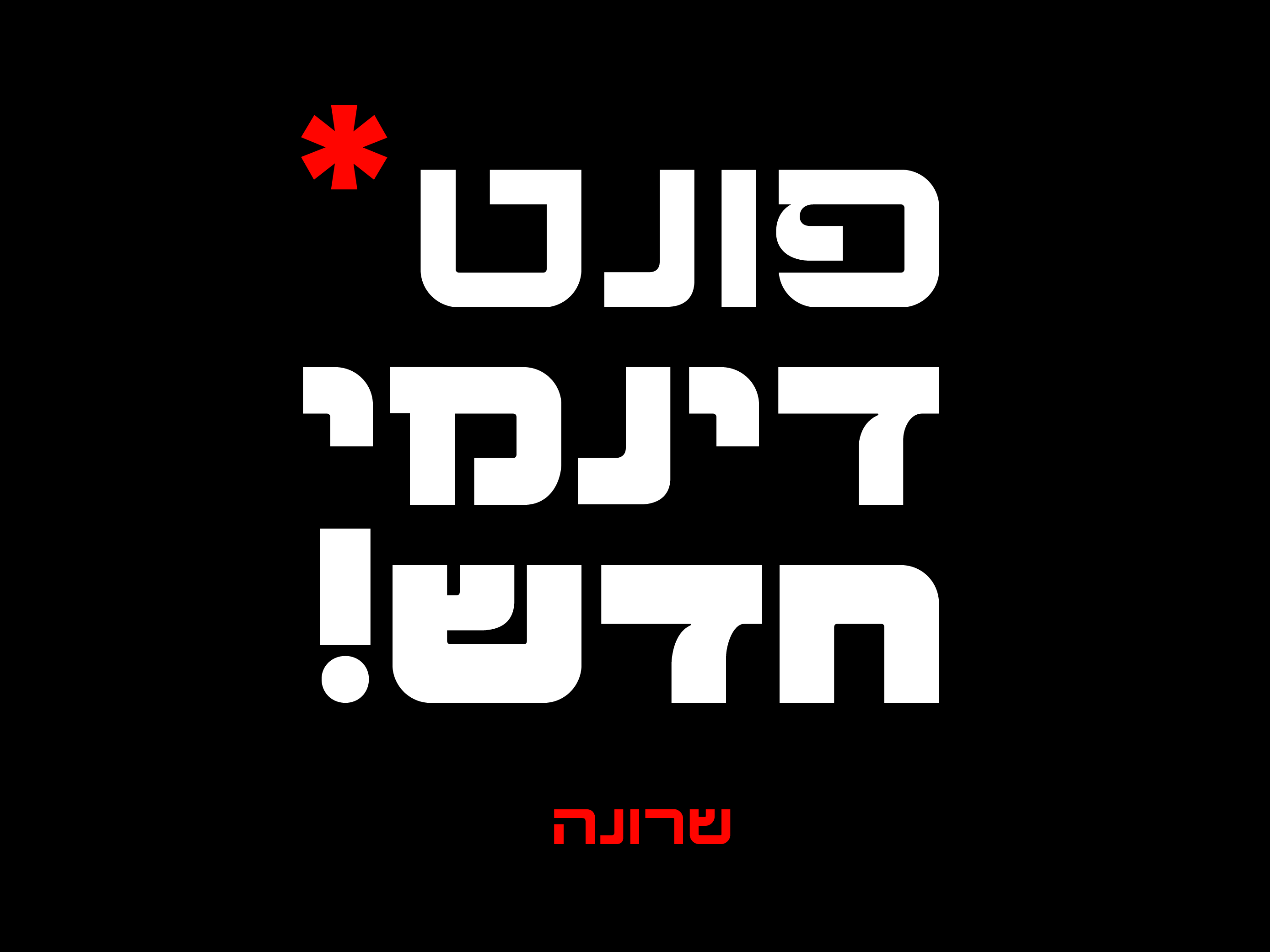
Bip
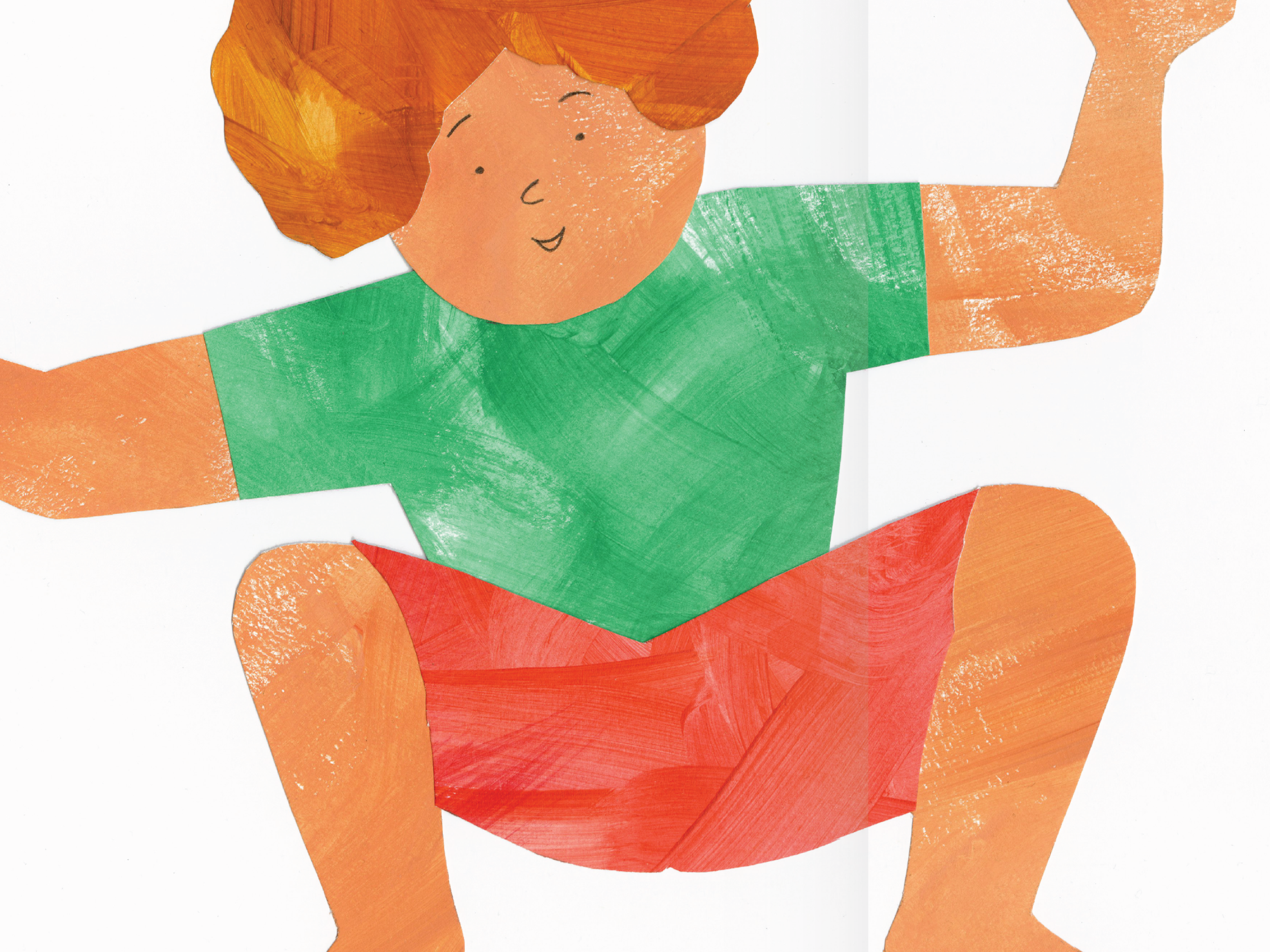
A rebrand for Bip - Israel’s iconic comedy channel (2001–2010), known for its absurd, satirical and unapologetically local humor. This rebrand reimagines Bip’s visual presence with a bold, expressive motion language while preserving the channel’s unmistakable comedic DNA.
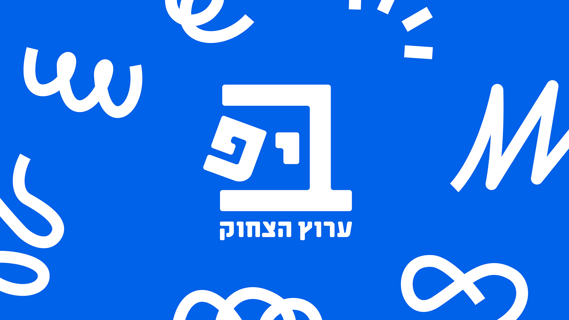
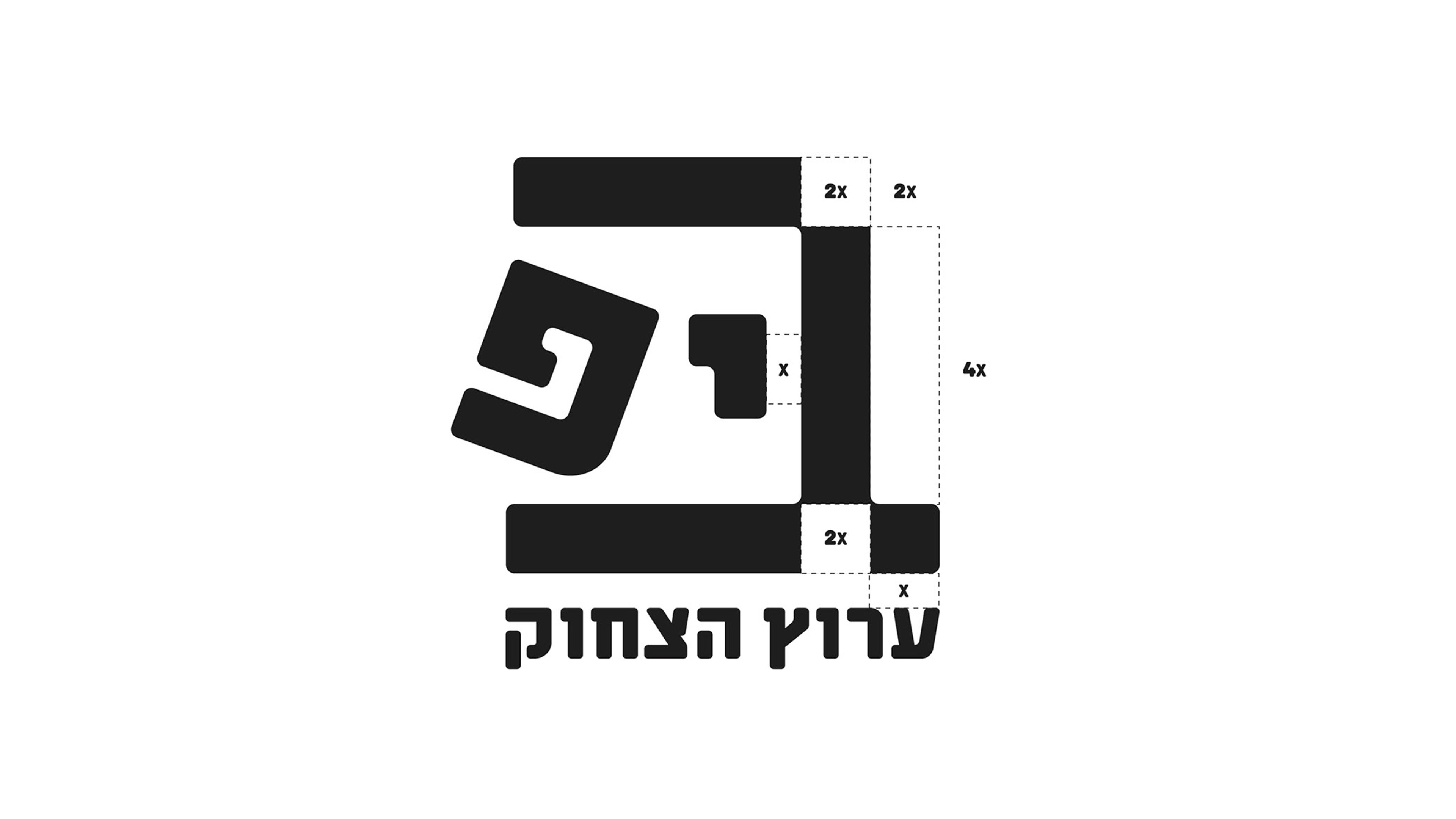
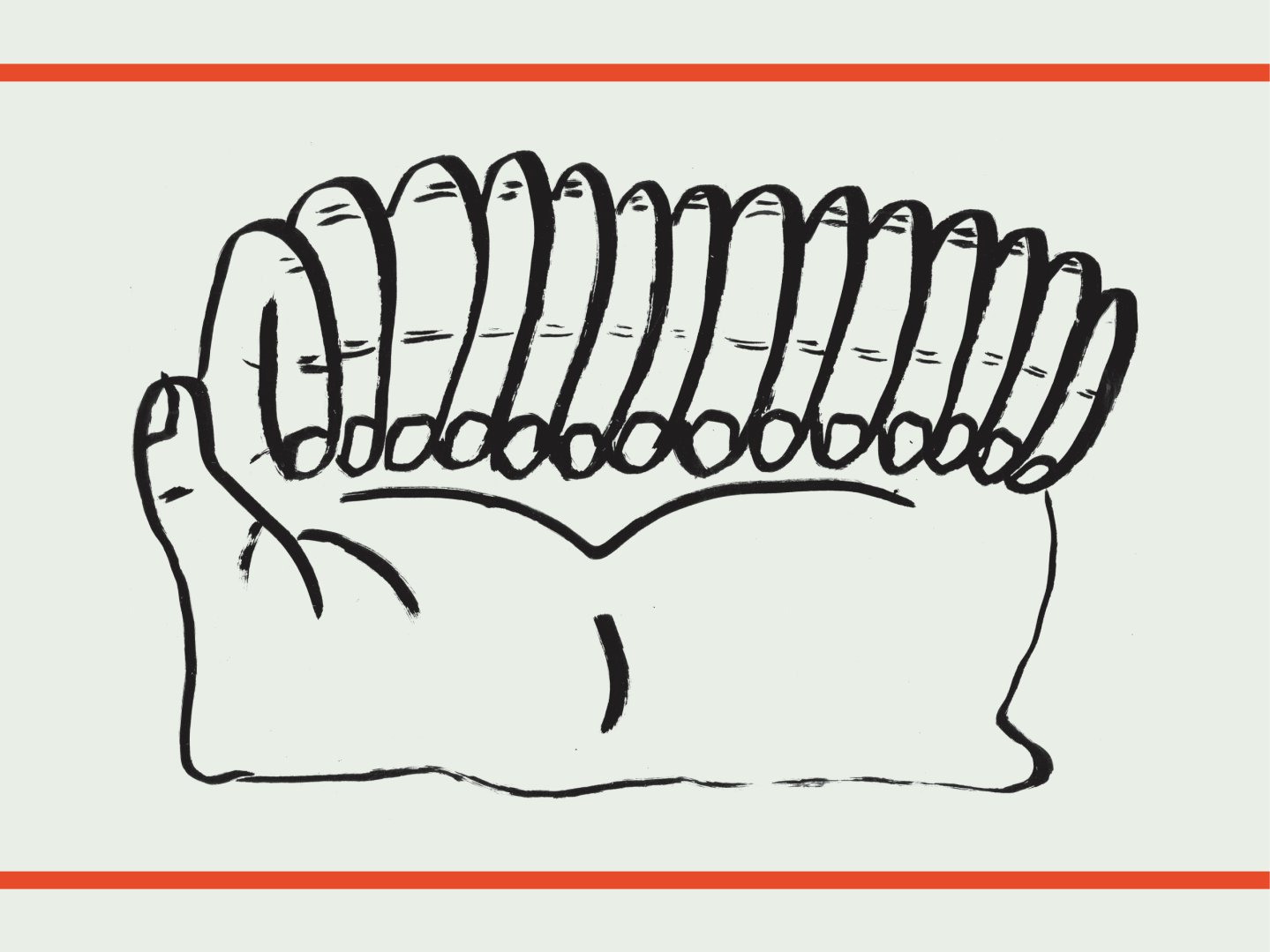
At the core of the identity is a typographic system shaped like a laughing mouth - thick, elastic strokes that stretch, bounce and react like facial expressions. The motion direction builds on this idea, using playful deformation, rhythmic timing and expressive transitions to capture the spontaneity of humor.
The result is a flexible broadcast package including logo animations, transitions and lower-thirds - that brings Bip’s comedic spirit to life in a contemporary, energetic way. A visual language that is simple, character-driven, and unmistakably Bip.